|
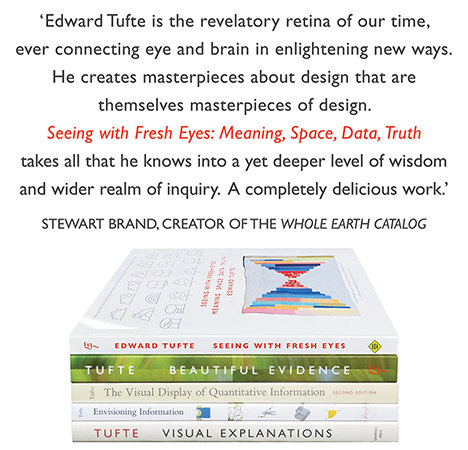
All 5 books, Edward Tufte paperback $180
All 5 clothbound books, autographed by ET $280
Visual Display of Quantitative Information
Envisioning Information
Visual Explanations
Beautiful Evidence
Seeing With Fresh Eyes
catalog + shopping cart
|
Edward Tufte e-books Immediate download to any computer: Visual and Statistical Thinking $5
The Cognitive Style of Powerpoint $5
Seeing Around + Feynman Diagrams $5
Data Analysis for Politics and Policy $9
catalog + shopping cart
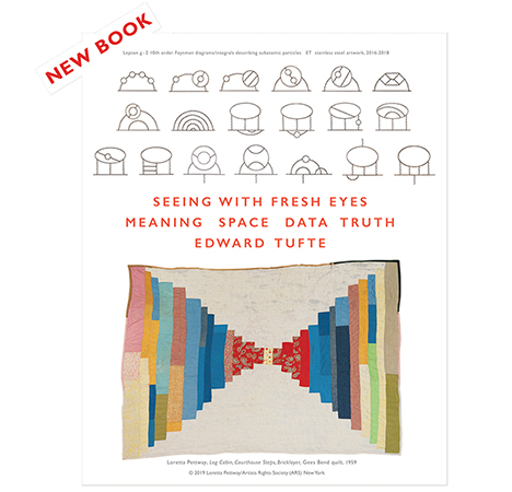
New ET Book
Seeing with Fresh Eyes:
catalog + shopping cart
Meaning, Space, Data, Truth |
Analyzing/Presenting Data/Information All 5 books + 4-hour ET online video course, keyed to the 5 books. |
Note by ET: In these two articles below, better to change the boxes with normal limits to sparklines with normal limits.
 |
The sparkline-like double-sided patient timeline is medically helpful, data-rich:
 |
Seth M. Powsner and Edward R. Tufte, "Graphical Summary of Patient Status", The Lancet 344 (August 6, 1994), 386-389.
 |
 |
 |
 |
Seth M. Powsner and Edward R. Tufte, "Summarizing Clinical Psychiatric Data", Psychiatric Services 48
(November 1997), 1458-1461.
 |
 |
 |
 |
From: Edward Tufte, Beautiful Evidence, p.47
 |
-- Edward Tufte
My book "Electronic Health Record: a Systems Analysis of the Medications Domain" has just been published. One of the chapters in the book - User Interface - takes into considerations principles from Mr. Tufte's work and from others and then presents a UI paradigm that is supposed to better support clinician's cognitive processes. Here is the chapter as PDF for your review.
-- A. Scarlat MD (email)
When we started research on EMR & EHR I've instantly recalled this research. We tried to put this on iPad, because it seems so natural choice. I've published some details on our research, user testing and recent review by a guru.
http://aojajena.wordpress.com/2012/08/27/mobile-emr-part-i/ http://aojajena.wordpress.com/2012/09/28/mobile-emr-part-ii/ http://aojajena.wordpress.com/2012/10/16/mobile-emr-part-iii
-- Vasyl Mylko (email)
Health Record Design Challenge
http://healthdesign.challenge.gov/
I would suggest all aspiring information designers take a look at the above link. The government is soliciting information design norms for medical records and this is a real chance to make a difference and put design principals into practice.
Not much time left - but this is really a real chance to show what can be done.
Criteria are:
- Overall Appeal - How does the entry feel visually?
- Patient Usefulness - Does it address the needs of a patient?
- Caregiver Usefulness - Does it ease the responsibilities of a caregiver?
- Physician Usefulness - Can a physician integrate it into their workflow?
- Visual Hierarchy - Can the most important information be easily found?
- Information Density - Is it easy to digest the information that is presented?
- Accessibility - Can a varied population make use of this document?
Seems like the perfect exercise...
-- Tarun (email)