|
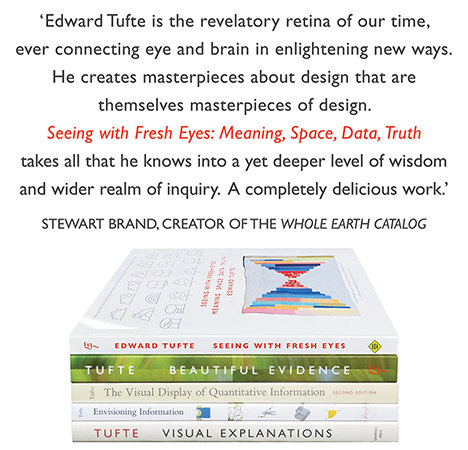
All 5 books, Edward Tufte paperback $180
All 5 clothbound books, autographed by ET $280
Visual Display of Quantitative Information
Envisioning Information
Visual Explanations
Beautiful Evidence
Seeing With Fresh Eyes
catalog + shopping cart
|
Edward Tufte e-books Immediate download to any computer: Visual and Statistical Thinking $5
The Cognitive Style of Powerpoint $5
Seeing Around + Feynman Diagrams $5
Data Analysis for Politics and Policy $9
catalog + shopping cart
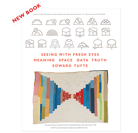
New ET Book
Seeing with Fresh Eyes:
catalog + shopping cart
Meaning, Space, Data, Truth |
Analyzing/Presenting Data/Information All 5 books + 4-hour ET online video course, keyed to the 5 books. |
It has bothered me for a long time that schools spend so little time and energy teaching students how to organize information in meaningful ways. I recently attended the Science Fair at my children's school and was impressed by the creativity of the experiments, and disgusted by the presentation of most of them. Information was displayed with no sense of organization, and the judges appeared to pay much more attention to the visual style of the presentations than to the content.
Obviously (as you've noted) having students create PowerPoint presentations instead of writing papers only exacerbates this problem. Is there any hope? Any chance of you writing a book specifically for elementary school educators? Or doing a series of seminars for them?
If you don't have any ideas on how we can change the schools, how about an idea of what I can do as a parent to help my kids understand and utilize good information design.
-- Mindy (email)
Keep good design books in your home. I was able to give my son (a freshman digital media major) help and and inspiration out of my own library. Also, take your children to good museums, like the Metropolitan Museum of Art and MOMA in NY or the Wadsworth Atheneum in Hartford. It's worth the trip. Don't forget public radio and public TV.
Unfortunately, society at large hasn't yet seen the value of a design education. We designers are marginalized, even though our work is vital. I hold the design profession in equal esteem with doctors and lawyers, although all my doctor and lawyer friends disagree.
-- David White (email)
It's not just schools. Last month I attended a the presentation of a set of semester projects for a Masters degree at one of the highest-graded university science and technology faculties in the UK. The presentation was in two parts: a static display with each project occupying an exhibiton stand in a concourse; and a stage presentation in a lecture hall. In the static displays each project evidenced the hard work of half-a-dozen students for a whole semester, but the live presentations differed hugely. About half adopted a straighforward business presentation approach: professional, high technical and scientific content, well argued - and interesting. The other teams went for soundbite, newsflash, kid's-TV docudramas. Most failed miserably. One elicited no questiions at all from the audience (there being no content to question), one was a squirming embarassment - but one was pure theatre and would not have disgraced a post-graduate showcase at a drama school. The intellectual content was virtually nil . . . but it was the one that won the votes of the scientific assessors - including five visiting professors.
-- Martin Ternouth (email)
Get you local school to participate in one of the national statistical contests. I only know these from looking at winners on the web. There's an abundance of evil pie charts, but overall students do a good job. Participation must teach some stats, reasoning, and display.
The American Statistical Association runs a student poster contest. See http://www.amstat.org/education/index.cfm?fuseaction=poster1
Statistics Canada offers a similar contest : http://www.statcan.ca/english/kits/winner/conwin.htm
[link updated March 2005]
-- melissa spore (email)
In mid-December,the WSJ published an interesting article on the adoption of the Singapore method of teaching mathematics by some US schools. While I was aware that Singapore consistently achieves very strong results in mathematics, I had not come across any explanation of the teaching methodology which, from the WSJ aricle, appears to be highly visual (I really think this thread is more about teaching info design at schools than the use of good visual design in teaching but this was the most appropriate thread that I could find). I'd be interested in hearing any comments on the approach being adopted.
-- Will Oswald (email)
|
|||||||||||