|
All 5 books, Edward Tufte paperback $180
All 5 clothbound books, autographed by ET $280
Visual Display of Quantitative Information
Envisioning Information
Visual Explanations
Beautiful Evidence
Seeing With Fresh Eyes
catalog + shopping cart
|
Edward Tufte e-books Immediate download to any computer: Visual and Statistical Thinking $5
The Cognitive Style of Powerpoint $5
Seeing Around + Feynman Diagrams $5
Data Analysis for Politics and Policy $9
catalog + shopping cart
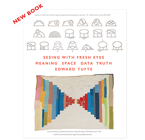
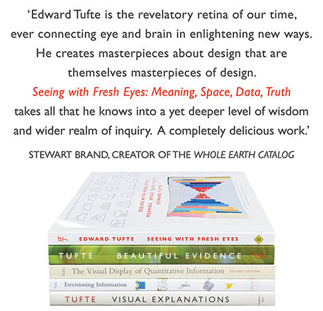
New ET Book
Seeing with Fresh Eyes:
catalog + shopping cart
Meaning, Space, Data, Truth |
Analyzing/Presenting Data/Information All 5 books + 4-hour ET online video course, keyed to the 5 books. |
My band is preparing to record our first full-length album, and I decided it would be helpful to prepare visualizations of our (complex) song structures for the producers to accompany our demo tape. My goal is to help the producers become familiar with our material as quickly as possible, while also spotting problem areas ("there are no drums here, so we'll need a click"), and providing a reference during mixing.
I whipped up a design for this and am looking for two things:
INPUT ON THE DESIGN
How is it? Can anyone recommend ways to improve it? Please keep in mind that I am on a very tight timeframe -- so anything highly elaborate is out.
REFERENCES TO SIMILAR WORK
Has this been done elsewhere? I would love to see other visualizations of song structure for this purpose.
Any input is greatly appreciated.
Thanks,
Ryan
-- Ryan Singer (email)
Here is another annotated diagram showing a process. These are the sound cue sheets (not in their original color, alas) for the mix of Apocalypse Now, drawn by Walter Murch; from the excellent new book by Michael Ondaatje, The Conversations: Walter Murch and the Art of Editing Film (New York 2002).
 |
 |
I prefer the funky, workaday, documentary style here rather than the geometric purity of the example below.
 |
This is an interesting design. Here are some improvements. Eliminate the dreaded legend by putting the labels for the instruments at the beginning and end of the time lines:
 |
The annotative style is good; place the words closer to the time line. The central axis type is inefficient; flush right/rag left instead will allow more detailed annotation. Put the whole thing on a very light grid background to encourage writing notes by hand on a printed version. Add a time-scale at the bottom. Add details about the source, date, place. Perhaps the words of the piece should flow along in parallel beneath the graph of the musical sounds.
-- Edward Tufte
Thank you for the thoughtful answer. I made the recommended changes and the producers and my bandmates are very pleased with the results.
-- Ryan Singer (email)
I think it's a great idea! My only suggestion would be to re-consider the placement of the different musical elements. Perhaps have the parts that are present throughout the entire song (such as the bass and drums) on the bottom, and stack the vocals and guitar parts on top.
I've been using a similar -- but much cruder -- technique for organizing my multi-track recordings. It's helpful for seeing where there is open track space for adding additional parts. In the example below, tracks 3, 7, and 8 all have multiple parts. Without a visual record, I invariably erase something by mistake...
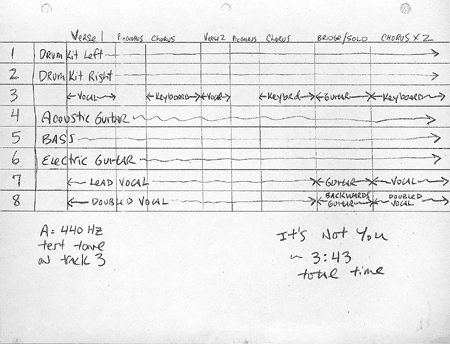
-- David Harrell (email)
|
||||||||||||||||||||